
Amsterdam on 27 April is orange. King’s Day empties the offices and fills the canals, and by mid-afternoon most of the city is on a boat, on a bicycle, or sitting on a kerb with a plastic cup. I spent the late afternoon of it indoors, at the Moco Museum on Museumplein, which is either the wrong choice or the best one depending on how much of the crowd a person wants.
And I went for Banksy. His is the name Moco leads with, on the banners and the posters and in the queue, and it is what I had built the afternoon around.
What I had not planned for was two of the other names on that banner. Andy Warhol I thought I had covered. I had stood in front of his Marilyns at Tate Modern the previous December and written about them, and I arrived expecting a smaller version of the same thing. Keith Haring I thought I knew even better, in the way everybody knows him, from tote bags and phone cases and the figures on other people’s T-shirts.
Both of those assumptions came apart upstairs. And the two men turned out to have known each other, and to have known Basquiat, in the same few streets of New York across the same handful of years.
Warhol and Haring at Moco at a Glance
🖼️ The Warhol · A 1979 Reversals Marilyn (the famous face printed in negative and cropped to an X), plus a diamond-dust Shoes screenprint.
✏️ The Haring · White-chalk subway drawings on salvaged black paper, drawn illegally underground between 1980 and 1985, most of which no longer exist.
🔺 The link · Warhol, Haring and Basquiat all knew each other in early-1980s New York; Basquiat has his own rooms in the same museum.
🧱 The postscript · Haring’s “make it reachable” argument runs on: LEGO released a 1,773-piece Dancing Figures set in 2025.
💡 Tip · Go upstairs. Most visitors spend their whole ticket on the Banksy floor and never climb to these rooms.
A Marilyn taken apart
The print is small, about 57 by 44 centimetres, hung alone on a dark wall.
![Andy Warhol’s Marilyn Monroe [Marilyn] [Retrospective Series], circa 1979, on a dark wall at the Moco Museum, Amsterdam](https://cdn.bubblyliving.com/wp-content/uploads/2026/08/warhol-marilyn-retrospective-series-moco.webp)
What is on the paper is two wide diagonal bands crossing near the centre of an otherwise blank sheet, and inside those bands are pieces of a face. An eye near the crossing point. A mouth. A section of hair. The tones are flipped, so where the famous Marilyn is bright the print is dark, and where she is dark it is pale. It reads like a photographic negative that has been cut down to the shape of an X.
The label dates it to about 1979 and puts it in the Retrospective series. That year matters more than the label lets on.
He was born Andrew Warhola, and dropped the final letter early in his New York career after a magazine printed his credit without it. By the late 1970s Andy Warhol was famous, busy and commercially successful, and doing very little that anyone found new. He was painting commissioned portraits of wealthy people. At the suggestion of his dealer Bruno Bischofberger, he went back into his own storage, pulled out the silkscreens he had made in the sixties, and started printing them again. Soup cans, electric chairs, Marilyn. The Reversals printed them as negatives. The Retrospectives combined several of them on one surface. Both series began in 1979, and the results were shown from 1980 in Zurich and Paris.
So this is Warhol raiding Warhol. The most reproduced image of the twentieth century, made by the man who made it that, taken back out and inverted.
Seventeen years earlier, in London
I have stood in front of the other end of this story, and I did not know it at the time.
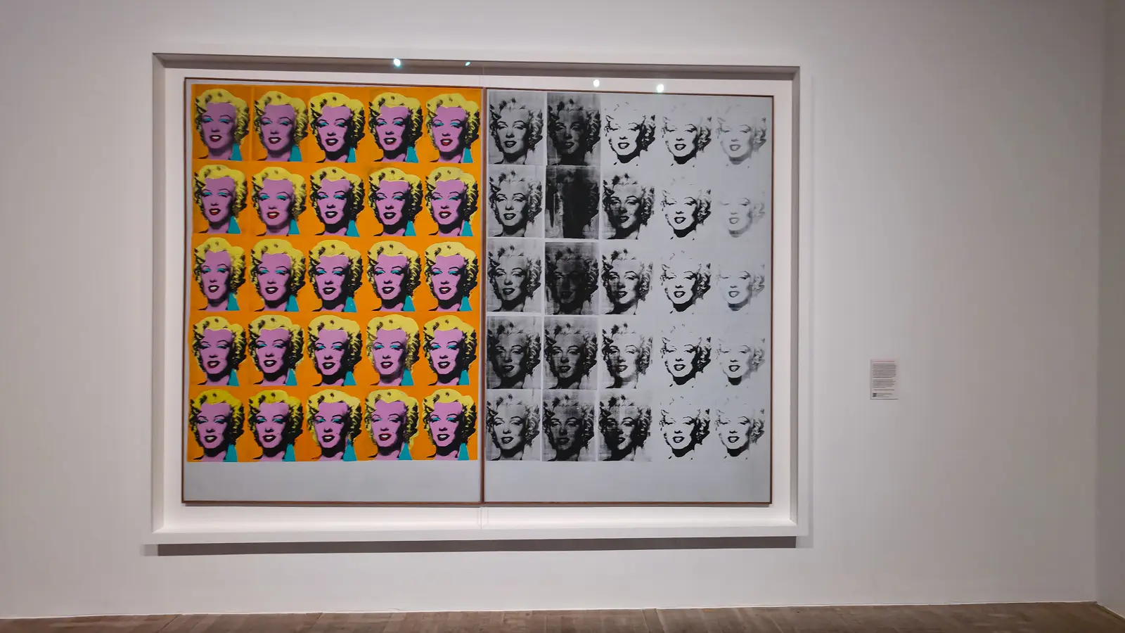
That is the Marilyn Diptych at Tate Modern, made in 1962. Fifty faces, colour on one side, fading grey on the other. I saw it on a wet December afternoon and wrote about it as fame on one side and mortality on the other, which is the reading it invites and the one everybody reaches.
Put the two in the same paragraph and something sharper happens. In 1962 he multiplied her until she stopped being a person and became a pattern. In 1979 he took the pattern apart. Same face, same photograph, same man, seventeen years and one shooting apart, and the second one undoes the first. Nobody who visits only one of these museums gets to see that.
Shoes, and a great deal of diamond dust
The other Warhol in the room is enormous and covered in glitter.
![Andy Warhol’s Shoes [Deluxe Edition], 1980, at the Moco Museum, Amsterdam, five silver high-heeled shoes on a glittering ground](https://cdn.bubblyliving.com/wp-content/uploads/2026/08/warhol-shoes-diamond-dust-moco.webp)
It is a screenprint with diamond dust, made in 1980, just over a metre high and a metre and a half across. Five shoes, tipped up on their heels, in silver on a silver field that catches the gallery lights and throws them back. Moco acquired it in 2022.
It is glamorous and slightly ridiculous, which I suspect is exactly right. It also closes a loop that the Marilyn opens: the man who spent the sixties turning famous faces into products spent the fifties drawing shoes for money, and at the end of it all he went back to the shoes and buried them in something that sparkles.
The chalk drawings
Upstairs the walls turn white and the work goes black.
![Keith Haring’s Monster & UFO [Subway Drawing], circa 1980, white chalk on black paper, at the Moco Museum, Amsterdam](https://cdn.bubblyliving.com/wp-content/uploads/2026/08/keith-haring-monster-ufo-subway-drawing-moco.webp)
Here is the honest part. I have never understood Keith Haring. I knew the figures the way everyone knows them, off tote bags and T-shirts and phone cases, and I had filed him under decoration. Bright, cheerful, everywhere, nothing to think about.
These are not that.
From 1980 to 1985 Haring rode the New York subway looking for those black panels, got off when he found one, drew fast in white chalk while people watched, and got back on the next train. He made over five thousand of them. He was arrested and fined repeatedly. He wrote that technically they were still graffiti, and that different police officers responded differently. Most were painted over or torn down within days when the next advertisement went up. The ones that exist did so by accident, because somebody cut them off the wall.
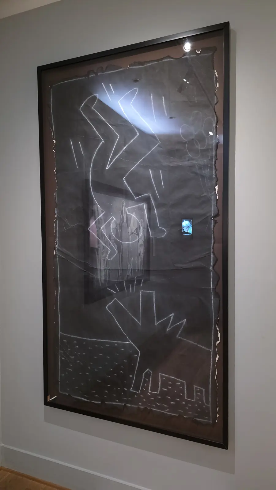
Standing in front of one, the thing that changed my mind was not the drawing. It was the surface. The paper is creased where it was folded, torn at the edges where it came off a wall, and the chalk has the softness of something laid down in seconds by someone who was in a hurry and knew it. That is not a decorative style. That is a man drawing at speed in a public tunnel because he had decided art should be where people already are.
What he was actually drawing about
The one that stopped me longest has a television in it.
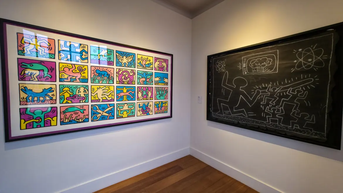
![Keith Haring’s Untitled [Nuclear Television], 1980 to 1983, white chalk on black paper, at the Moco Museum, Amsterdam](https://cdn.bubblyliving.com/wp-content/uploads/2026/08/keith-haring-nuclear-television-subway-moco.webp)
A large figure kneels on the left with one arm raised. Above it a television set is showing a mushroom cloud, drawn as a cloud with rain falling out of it. Two atoms spin in the upper corners. On the right a group of small figures runs, and a long shape with radiating lines drives towards them.
Nuclear fear, on a subway wall, in chalk, in about 1981. This was drawn in the years when American and Soviet arsenals were the everyday background of the news, and it went up in a place where thousands of commuters would pass it before somebody scraped it off. That is a very different thing from a tote bag.
![Keith Haring’s Untitled [Winged Mermaid and Dolphin], circa 1983, at the Moco Museum, Amsterdam, beside a smaller black and white print](https://cdn.bubblyliving.com/wp-content/uploads/2026/08/keith-haring-winged-mermaid-dolphin-moco.webp)
The vocabulary is the same across all of them. Radiating lines for movement or danger, a barking dog, a crawling baby, figures with no faces. He built that alphabet underground, through sheer repetition, so that a drawing could be finished before anyone official arrived.
And then the bright one
The last room puts the two halves of him side by side.
In 1986 Haring opened the Pop Shop in downtown Manhattan, selling badges, posters and T-shirts of his own images. He was criticised for it by people who thought an artist should not run a shop, and he argued that it kept the work reachable for anyone who could never buy a painting. The tote bags I had dismissed him for are, in a sense, the plan working.
That argument is still running without him. In May 2025 LEGO released a Keith Haring set, five dancing figures in 1,773 pieces, made with the cooperation of his Foundation and based on a 1987 work of his. It comes with five separate instruction booklets, one per figure, because it was built to be assembled by several people at once rather than by one person alone. Of all the ways an estate can be handled, a kit designed so that a family makes the thing together is close to the point he kept making.
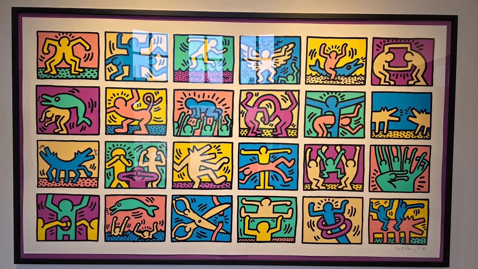
Twenty-four squares, hot pink and yellow and green, packed with the figures everyone knows. This is the Haring I thought I already understood, and now it looks like something else: a man in the last year of his life setting out his whole vocabulary at once, in the colours he chose after five years of having only white chalk.
They all knew each other
None of this happened in separate rooms.
On 4 October 1982, Bruno Bischofberger brought Jean-Michel Basquiat to Warhol’s Factory and introduced them. Warhol took a Polaroid. Basquiat left, and within a couple of hours a painting of the two of them arrived at the studio. Warhol reportedly said he was jealous, because Basquiat was faster than he was. He became Basquiat’s landlord. Between 1984 and 1985 they made around 160 paintings together, taking turns on the same canvas, and showed them at the Tony Shafrazi Gallery in September 1985. The reviews were brutal. The New York Times called Basquiat an art world mascot and the whole thing a Warhol manipulation. They drifted apart afterwards. Warhol died in February 1987 and Basquiat eighteen months later, aged twenty-seven.
Haring was there for all of it. He met Warhol in late 1982, at the closing of his own show at the same Shafrazi gallery, and Warhol became his mentor. Haring wrote afterwards that the greatest thing Warhol gave him was simply his public backing, and that Warhol taught him how to carry the success that arrived while they were friends. In 1986 he made a print series called Andy Mouse, Warhol drawn as Mickey Mouse, which is a fairly complete statement of what he thought of the man.
So the two artists in these rooms are not a pairing a curator invented. They are two thirds of a triangle, and the third corner has his own rooms in the same building.
Bubbly Tips
- Go up before you go deep. The Warhol and Haring rooms are above the Banksy floor, and a lot of visitors spend their whole ticket downstairs and leave without climbing.
- Read the small labels, not the big wall texts. The wall panels give biography. The individual labels give the dates, dimensions and provenance, and that is where the interesting things are.
- Look at the edges of the Haring papers. Torn, creased and folded. Those marks are the reason the drawings survived at all, and they say more than any caption.
- Check what is on loan. Several of the strongest works here are private loans rather than Moco’s own collection, so they may not be there on a later visit. The permanently owned ones say so on the label.
- Give the Marilyn a full minute. It looks like an abstract shape from across the room. The face only assembles once you are close, and finding the eye is the whole experience.
- Moco is small and it gets crowded. It is a converted townhouse, not a purpose-built gallery, and the rooms are domestic in scale. Early or late in the day makes a real difference.
- Book online in advance. Timed entry sells out, particularly at weekends and around King’s Day, and there is no queue-jumping at the door.
- Pair it with the neighbours. Moco sits on Museumplein with the Rijksmuseum and the Van Gogh Museum a short walk away, so an afternoon here works well after a morning at either.
- Allow more time than the museum’s own estimate. The suggested run-through assumes you glance at everything. Two of these rooms deserve twenty minutes each on their own.
- Photography is allowed and the lighting is low. Steady hands, no flash, and be patient about reflections on the glazed works.
Final Thoughts
I came for the artist who does not sign his real name, and I left thinking about a man who dropped a letter from his and another who drew in chalk knowing it would be gone by Thursday.
The Warhol I found had gone back into his own archive and pulled his most famous image apart. The Haring I found was not the one on the tote bags. He was somebody who worked out an entire visual language on stolen advertising space, at speed, for an audience of commuters who had not asked for it, while being fined for the privilege. I had spent years assuming that work was cheerful. It is not cheerful. It is urgent, and the difference took me until a room in Amsterdam to see.
Until next time!

🌟 Everything You Need to Plan Your Dream Trip in 2026
- 🌟 Luxury Hotels - Find premium stays with Booking.com & Hotels.com
- 🏡 Vacation Rentals - Discover unique properties on VRBO
- 🏞️ Guided Tours - Explore with Viator or GetYourGuide
- 🎫 Attraction Tickets - Skip the lines with Tiqets
- 🚢 Ocean Cruises - Set sail with Cruise Direct
- 📱 International SIMs - Stay connected with Saily
- 🚗 Car Rentals - Budget-friendly options from Discover Cars
- 🌐 Secure VPNs - Browse safely with NordVPN
- 💶 Currency Exchange - Best rates with Wise
- 🗣️ Learn Languages - Master the local language with Babbel and Rosetta Stone